G
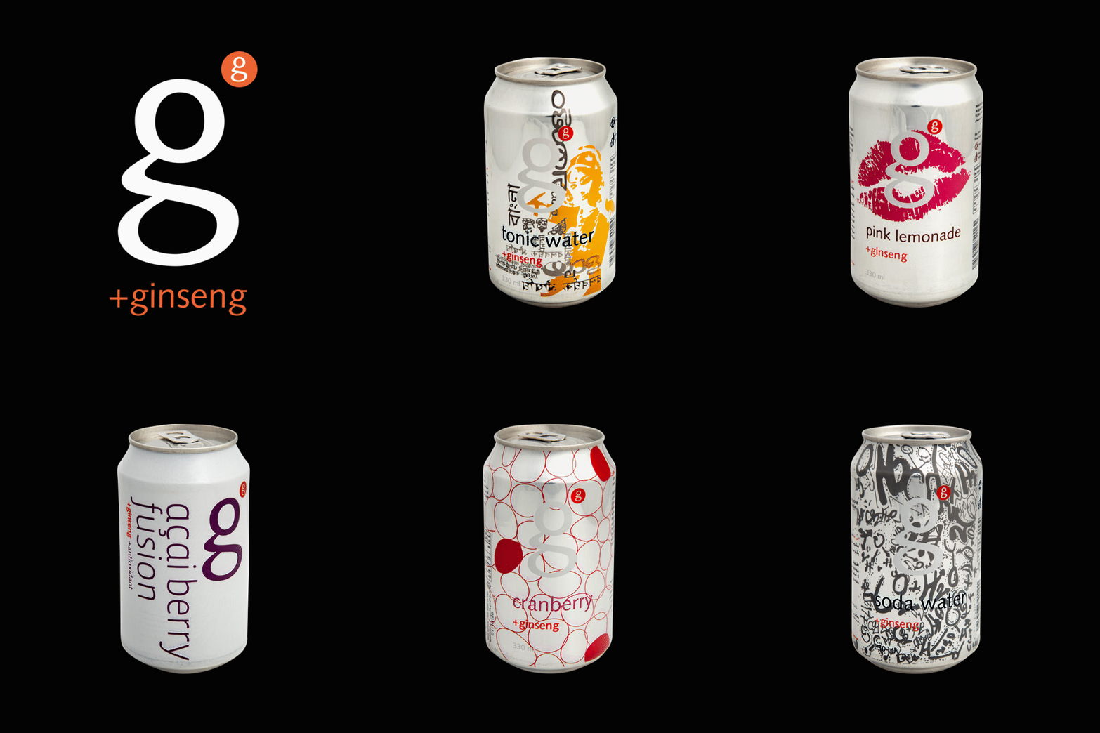
Branding and packaging design for a daring, pioneering beverage product.
In a marketplace dominated by big global brands and poorly designed local 'copy-cats', G represented a revolutionary approach in brand development. SYNTAX responded with a minimal typographic solution, and a big attitude. The stark design was placed on the original tin metallic surface, created a powerful and totally differentiated position on the shelf, which propelled the brand to instant recognizability and success.
